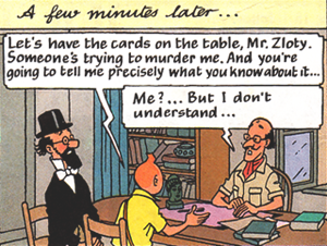
handlettering vs. "pretty" computer font
October 22, 2012
Reading my son a newly purchased edition of The Seven Crystal Balls, one of my favorite Tintin books, I realized that all of the dialogue bubbles had been redrawn. The new lettering was of a much finer line, it was much more regular, and, for some reason I couldn’t put my finger on, it was weirdly repellent. I don’t mean that it was ugly. It was actually rather delicate and pretty, but I felt that somehow the text was putting me off: I couldn’t get into it.
For some reason, I just couldn’t keep both the text and the pictures in mind at the same time—a crucial cognitive activity for reading an graphic narrative. There was a mysterious disconnect between the two, and I sensed a kind of fog between me and the story. This was frustrating because reading my son Tintin is one of our favorite shared pleasures these days. I’d rushed through the dishes, through picking up the scattered tinkertoys, through checking my email one last time, just to get on the couch with him and get a few pages in before tucking him into bed.
So what a disappointment it was to suddenly feel that my old friend Hergé was holding out on me somehow. I studied the print more closely, and discovered, to my enormous dismay, that it was, in fact, print outline: none 0px;">print—some computer font meant to look like tidy, slightly rounded, vaguely European handwriting, and yet it was, in fact, none of these things.
This is an example of the new computer lettering. If you look closely, you can see that, despite first impressions, every “t” is the same as the other “t,” likewise with every “e,” “y,” and so on. The result, in my opinion? A coolness or slickness that causes disengagement with the story:
By googling around to see who else might be lamenting the new changes, I discovered this discussion on the web site Tintinologist, and learned that the original lettering was done by a man named Hyslop. Some people in this thread claim that the computer font is horrendous only when badly kerned. But I find it hard to believe that any computer lettering could approach the intimacy, energy and, above all, the incredible attention of Hyslop’s hand. (Comparison images taken from Cigars of the Pharaoh
Sadly, I found myself rushing thoughThe Seven Crystal Balls even faster than I’d rushed through the dishes. The most curious thing about reading the new edition was the sense that the words shared no real connection to the pictures in which they were embedded. Normally, when I read the old, Hyslop versions of Tintin, my eye wanders back and forth from picture to text. So much so, in fact, that my children often have to beg me to get on with the story. Hyslop’s lettering seems integral to the pictures; his dialogue boxes feel like speech. But the new computer-generated dialogue boxes read merely as the representation of speech. Big difference. They become a kind of parallel but separate story, connected only tenuously to Hergé’s drawings, and the whole experience feels slightly off-kilter.
The new lettering is a kind of butchering of Hergé's work. Whoever made the decision to go with the computer font at Casterman (Tintin's publisher) cannot, in my opinion, possibly love Tintin, and whoever does not love Tintin should be in no position to make such a decision.
How the visual impact of the actual phsycial incarnation of text effects the reading experience is a big and pressing question these days, now that digital reading is surpassing paper-and-ink reading at such an incredible rate. How different is our engagement with a book in our hands than it is with a “book” on a screen? What qualities are lost? What qualities are gained? I’m sure there are a few dozen dissertations being written on these issues right now. I’d like to ponder the question further, myself, but at the moment I'm off to scour Amazon for mint condition old Hyslop editions of Tintin to replace our entire collection (most of which is in tatters) before it’s too late.
-


